Build a Pendulum Activity
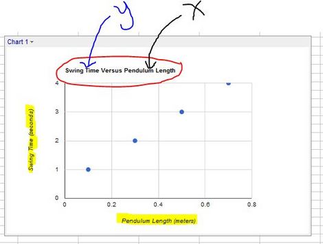
After you have gathered all of your data for all of your variables, use your data table and the "Insert chart" tool in Google Docs to make three scatter-plot graph (one for each independent variable). Make sure your charts follow the rules for making good graphs. Your graphs should be formatted like the graph below.
When you have finished making your three graphs, show them to Ms. Clanton before continuing.
